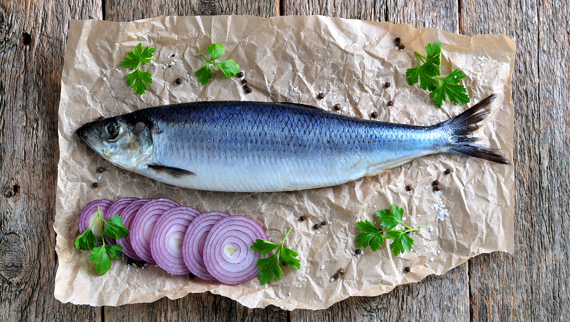
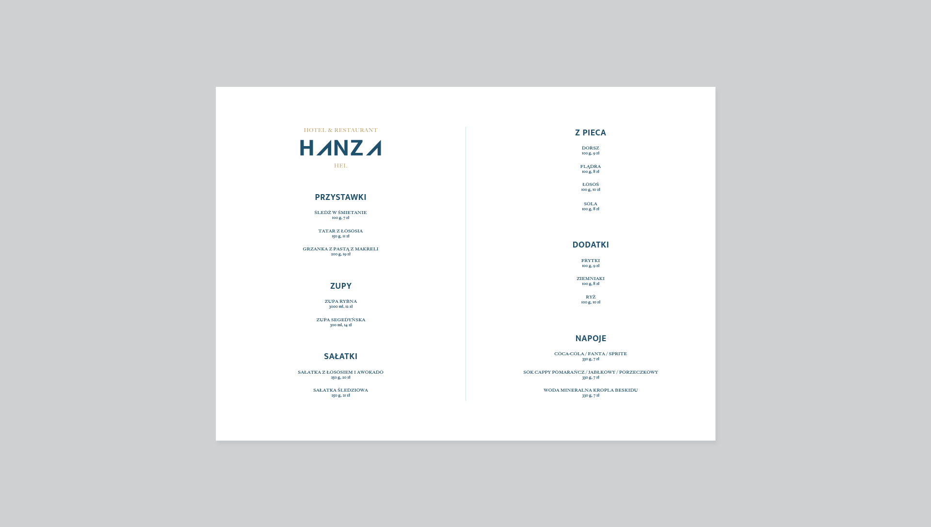
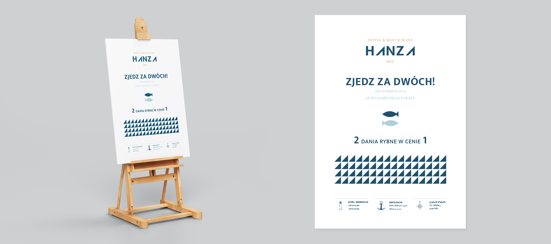
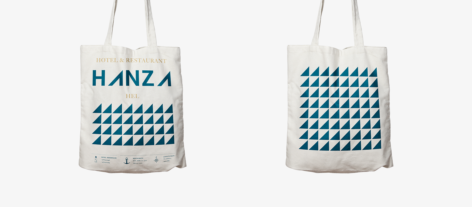
Branding małego hotelu i restauracji z Helu, serwującej dania ze świeżych ryb*. Prace nad tym projektem obejmowały stworzenie ogólnego key visualu, a także loga, projektu menu i plakatu oraz reklamowej torby płóciennej.
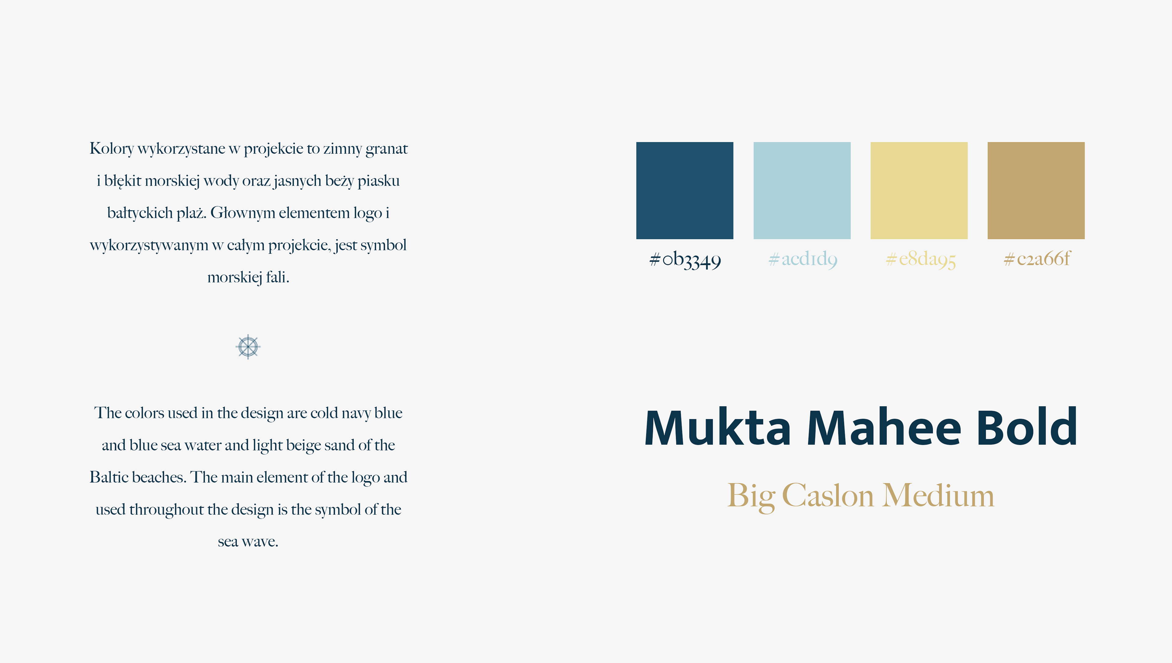
Kolorystyka projektu odwołuje się do chłodnych wód Bałtyku pogrążonego w sztormie - fala była główną inspiracją do stworzenia znaku i wzoru graficznego. Styl brandingu jest minimalistyczny i nieco surowy.
*Obiekt zmienił nazwę i właściciela po pandemii 2020 r.
Branding of a small hotel and restaurant from Hel, serving fresh fish dishes*. Work on this project included creating a general key visual, as well as a logo, menu design, poster and advertising canvas bag.
The color scheme of the project refers to the cold waters of the Baltic Sea immersed in a storm - the wave was the main inspiration for creating the sign and graphic design. The branding style is minimalist and slightly austere.
*The facility changed its name and owner after the 2020 pandemic.